Typography Reinforces Our Brand
Typography is more than a font or text size. It is another tool to reinforce our brand. For example, one of the University’s core values is “compassion” and one of our tonal characteristics is “approachable.” If our typography is not easy for the viewer to read, nor is it easy for our marcom professionals to access, then we are not upholding our promise, are we? By following our typography guidelines, we continue to create and build brand recognition.
Brand Fonts
Proxima Nova Regular is our sans-serif font for professional/advertising use.
It is a highly versatile font that can be utilized in a variety of design applications. It is known for its clean and modern look, making it ideal to convey a sleek and sophisticated image. It is also highly legible, making it a great choice for both print materials and web design.
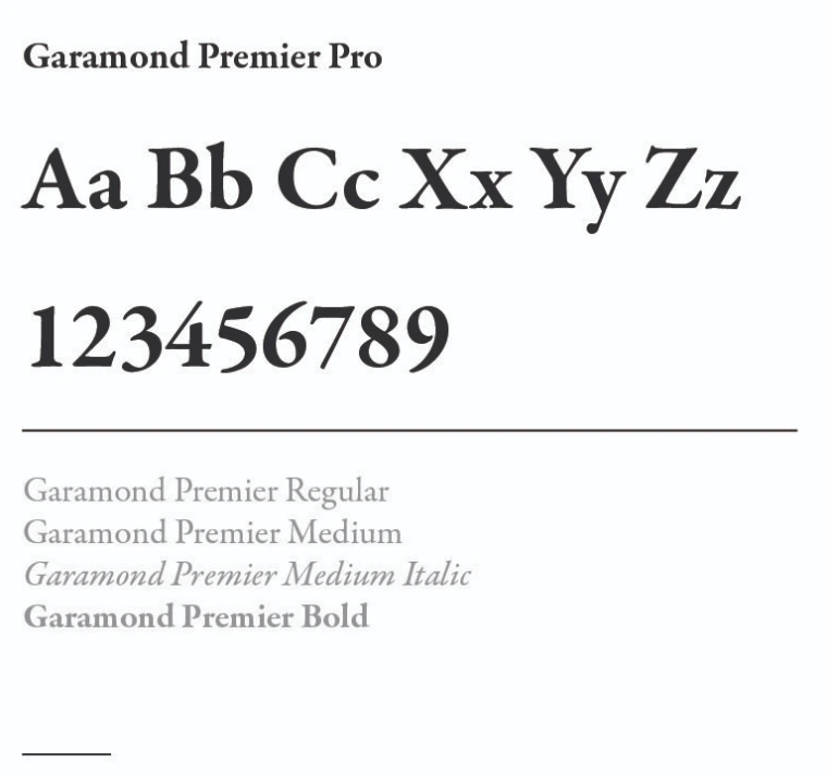
Our serif font is Garamond Premier Pro.
It offers a more classic and traditional look, ideal for adding sophistication and elegance to any text. For instance, Garamond Premier may be what your dean uses for a presentation or what you might choose for a high-level event.
When these two fonts are used together, it creates a balanced and harmonious design that captures the attention of readers while making the content appear professional and polished. This combination is perfect for creating a visually dynamic and modern design that is both engaging and readable for a wide range of audiences.
Legacy Fonts
Our legacy fonts, Milo and Friz Quadrata, are ONLY used for official "Block A" logo lockup versions (Milo and Friz Quadrata) and on-campus signage (Friz Quadrata).
Accessing Our Brand Font
Proxima Nova Font and Garamond Premier Pro can be downloaded for free through Adobe Creative Cloud.
Need access to Creative Cloud?
To request access to Adobe Creative Cloud at work, contact your department’s designated Adobe Creative Cloud IT representative. If you’re unsure who to contact, you can view the list of Adobe Creative Cloud IT Representatives. Your representative will reach out to confirm your license activation and aid in installing Adobe Creative Cloud on your computer.
If there’s a use that requires Proxima Nova or Garamond Premier Pro and you do not have access to Adobe Cloud, contact brand@arizona.edu for a list of specific font faces to assist with design, access and budget.
How to Use Our Fonts
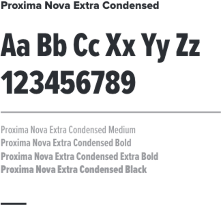
Proxima Nova Extra Condensed
Proxima Nova Extra Condensed should only be used for bold headline design purposes. It should always be used in all caps.
Proxima Nova
Proxima Nova can be used for headline, subhead and body copy design purposes.
Garamond Premier Pro
Garamond Premier Pro should be paired with the primary font of Proxima Nova. This font should be used for subheadings and body copy.

Alternative Fonts
Calibri is our alternate sans-serif font meant for everyday uses in Microsoft Office (Word, PowerPoint, Excel and Outlook). This includes Trellis Marketing Cloud for our e-communications.
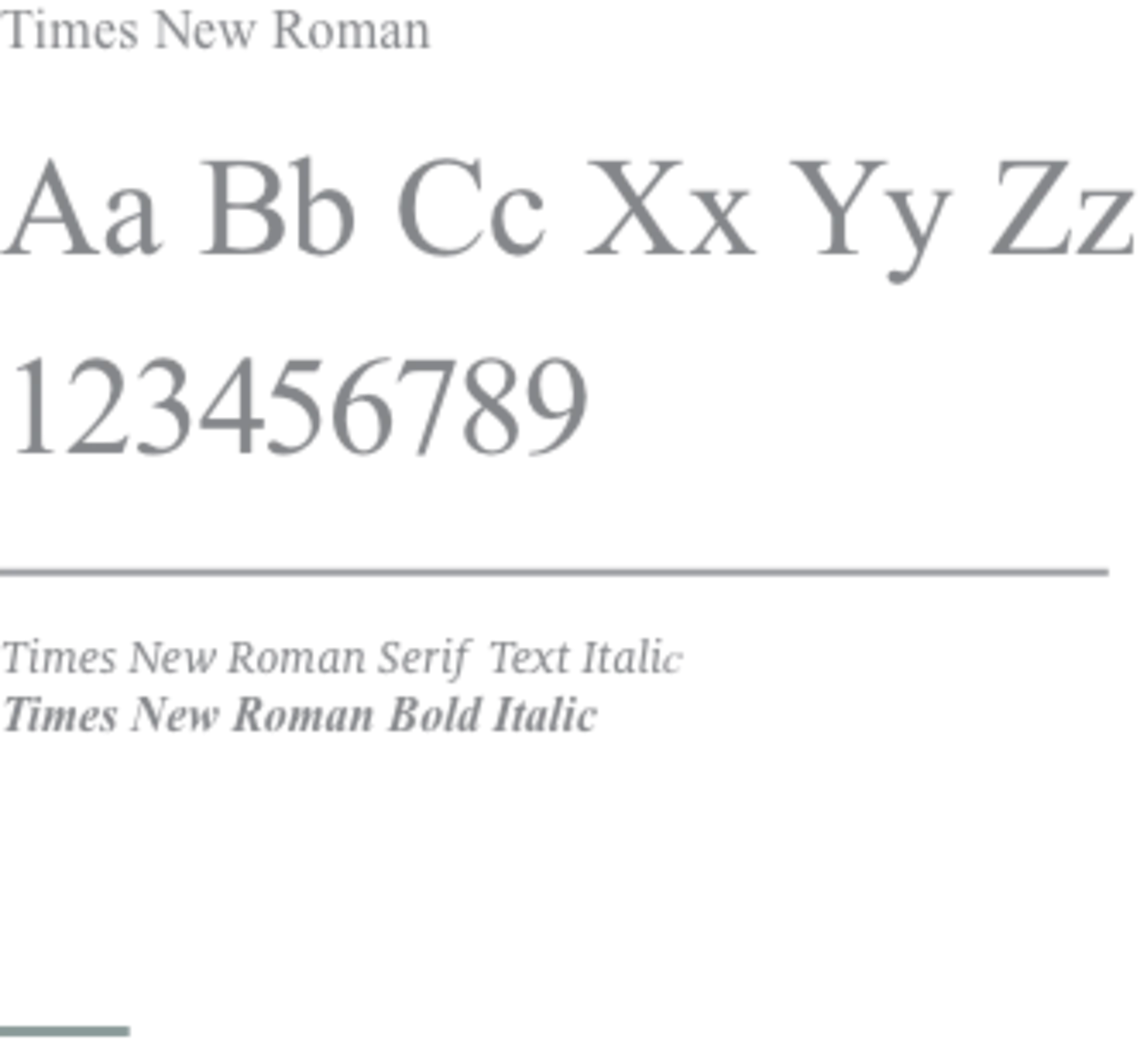
Times New Roman is our alternative serif font, reserved for formal documents in Microsoft Office.

Designing With Type
Guidelines and considerations:
- Pair different typefaces to create emphasis, texture and a visual hierarchy. Good typography helps the reader navigate the text.
- Use fonts, weights, color and point size to tell a story.
- Use plenty of surrounding white space.
- Limit the number of styles and sizes to create consistency and support the visual hierarchy.
- For greatest legibility, use 9- to 12-point fonts for print body copy and 12 to 16 pixels for web body copy. Use 24+ point fonts for presentations.
- Use 14 to 16 pixels for long-form digital copy.
Avoid designs that impede readability, such as:
- Using all capitals in blocks of type that are three lines or more.
- Condensing or expanding typefaces.
- Adding excess spacing between characters.
- Overusing emphases — if too many things are emphasized, nothing stands out.
- Using type with drop shadows.
- Using outline type.
Examples of Typography Use Cases
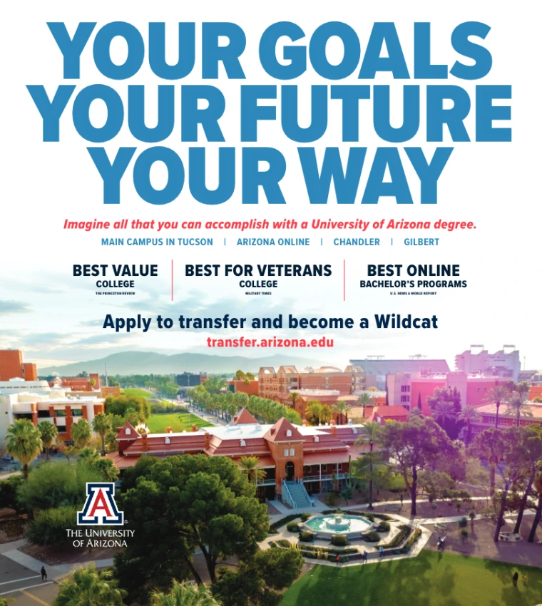
Fall College Guide Ad
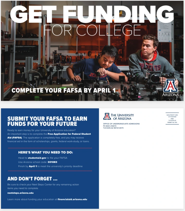
FAFSA Priority Deadline Postcard
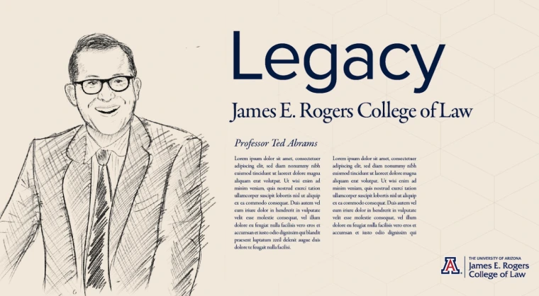
College of Law Graphic Using Garamond Font

College of Law Graphic Using Garamond Font
Web Fonts
University Information Technology Services and the Arizona Digital team have integrated the Proxima Nova font into its QuickStart 2 web platform. Please note our previous Milo font enterprise license is expired.
If you are on a QuickStart 1 site and have not yet migrated to QuickStart 2, you should already be scheduled for migration with the UITS team. If you are not yet scheduled for migration, please reach out to the UITS team.
If you are not using a QuickStart site and do not plan to migrate to QuickStart 2, you can update your web platform code to use Proxima Nova by way of Adobe Typekit, which can be found here. If you are already using Arizona Bootstrap, Proxima Nova will need to be added to your project

